In order to do its job and serve its community, every school and district fundamentally needs two things: students and money. A national demographic trend is driving down enrollment everywhere and taking revenue with it, leaving school leaders scrambling to stabilize their systems in order to provide the excellent education that children deserve and that communities demand.
While everyone has a favorite idea about how to get that stability (like cutting programs and services, consolidating buildings, advocating for state policy changes, and writing grants), the climate data that we’ve collected from staff, parents, students, and communities points to something much more directly aligned with your mission: stakeholder confidence.
Examining our survey data over the past years shows a clear link between a district’s climate (as perceived by staff, students, and parents) and enrollment growth.
Our community survey data shows a similar connection between taxpayer satisfaction and willingness to provide their schools with the revenue they need.
Part I: Climate shows up in enrollment!
Every superintendent eventually asks us some version of this question: Does school climate actually show up in the numbers that matter to my board?
The short answer is yes, in several ways (attendance, achievement, staff retention, and so on). But the one I want to focus on here is enrollment. Does providing a healthy climate draw students in and keep them coming back?
To answer that question, I lined up our Wisconsin staff, parent, and student surveys with each Wisconsin district’s official fall headcount and compared districts that started out the same size.
Healthy climates do predict enrollment growth, and that effect gets bigger with time.
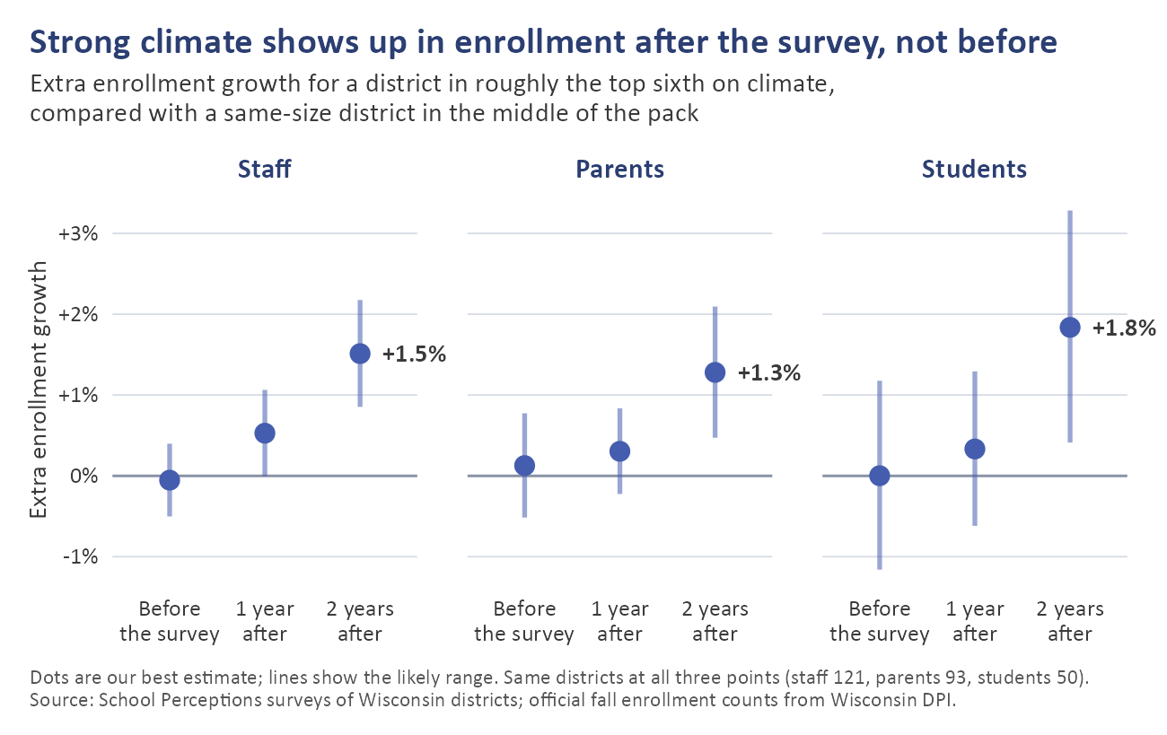
The chart below shows consistent effects across stakeholder groups. I controlled for prior-year surveys, which is why the “before the survey” data point sits at zero. For each group of staff, students, and parents, you can see a slight uptick in enrollment in the year following good survey results and a bigger uptick in the second year after that survey.
|
What is this graph showing? This graph is showing how many more kids districts gain when their climate scores are in the top one-sixth of performers. For example, school districts that are in the 84th percentile or above in terms of how happy staff are will see 1.5% more kids than school districts in the 83rd percentile or below. |
Take two districts of the same size. If one scores in roughly the top sixth on staff climate and the other lands in the middle of the pack, the first tended to grow about 1.5% more over the next two years. Parent climate told the same story (1.3%), and so did student climate (1.8%).
In a district of 1,000 students, that’s 13 to 18 kids. At a Wisconsin statewide average of about $16,000 per pupil, that’s $208,000 to $288,000 of additional revenue.
Just as important is when it shows up. Climate didn’t line up with growth that had already happened. It lined up with what came next.
“Well, maybe school districts that have more money are just happier?” Fair thing to raise. Higher-poverty districts tend to score lower on climate, and they’ve been losing students faster. I want to be sure I’m not measuring poverty and calling it climate. So, I also compared districts with similar poverty and a similar setting: city, suburb, town, or rural (those are the NCES locale classifications).
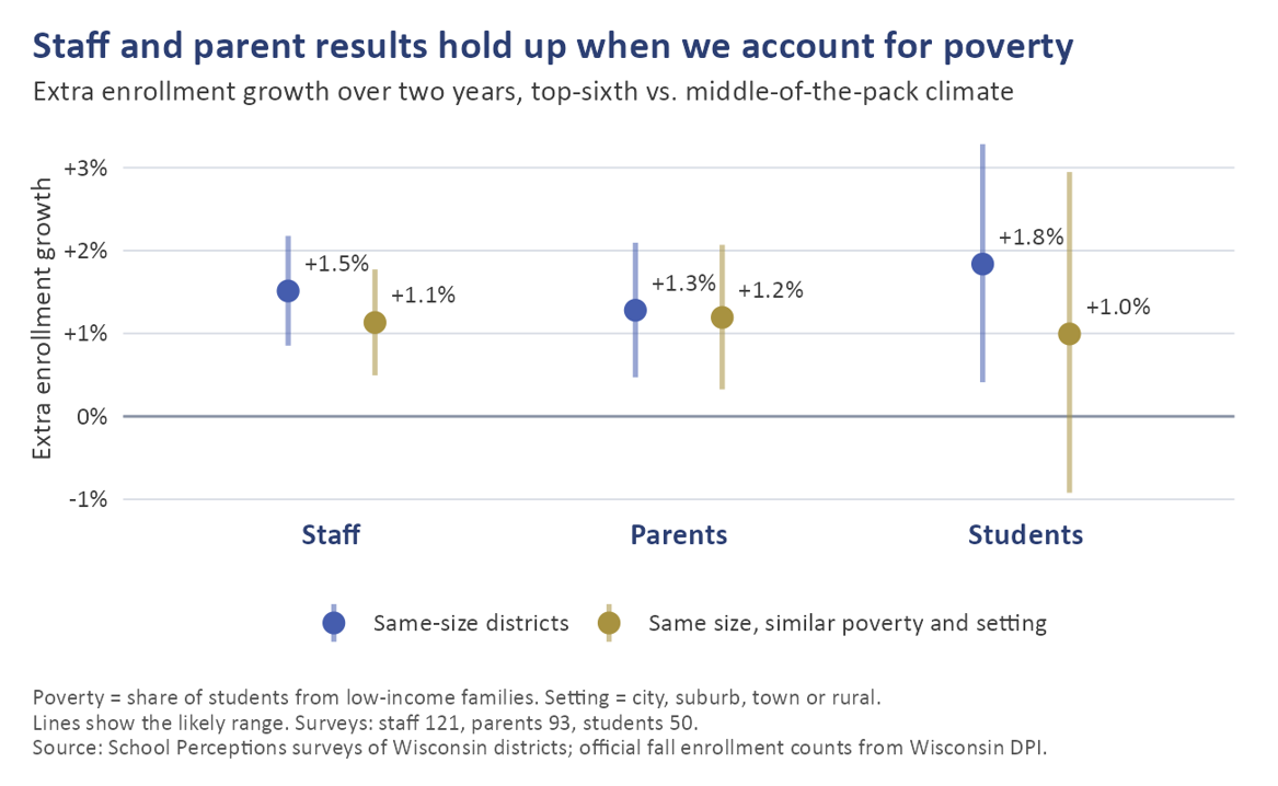
The chart below shows those results. The blue data points are the same as the chart above, and the gold data points are what we see after adding those controls.
Every group continues to show positive impacts.
|
What is this graph showing? The same enrollment gains as above (in blue), but this time with some additional contextual factors added (in gold). The bottom line is the same: in the two years following high survey scores, those districts see healthier enrollment than other districts. |
Staff and parent results hold up when we account for poverty; the student effect drops but remains significant.
For staff and parents, the pattern holds. For students, the effect shrinks to something closer to the parent and staff effect.
Now, this is a pattern. It’s not a causal promise that raising your climate scores will add students. But climate moves first, and it isn’t just poverty in disguise. That makes it an early signal worth watching.
Part II: Community Trust Pays Dividends!
Whatever strategic plans, building projects, or budgetary needs our community surveys ask about, they always ask residents to say how they perceive the their school district is doing along four dimensions:
- the quality of education
- keeping the public informed
- building community pride
- spending tax dollars wisely
That last one about fiscal stewardship is the one to watch.
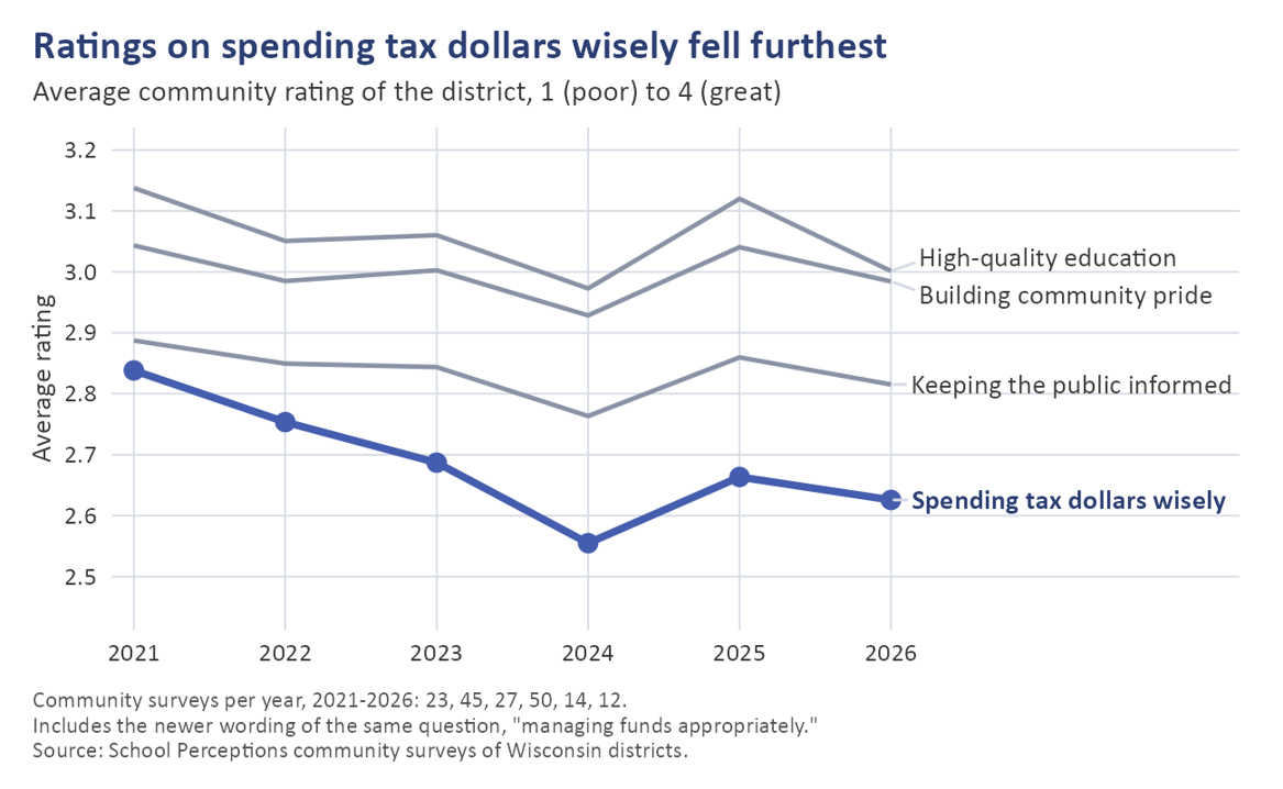
First of all, it’s the one that fell the most when Americans’ trust in institutions was cratering during and after COVID. From 2021 to 2024, ratings on “spending tax dollars wisely” dropped about twice as much as the other three, and they’ve only partly bounced back. Seventy percent of the districts we surveyed both before and after 2022 saw it slip.
|
What is this graph showing? Here we see our four dimensions of community satisfaction with school districts. Fiscal trust fell furthest since 2021 and has not recovered. |
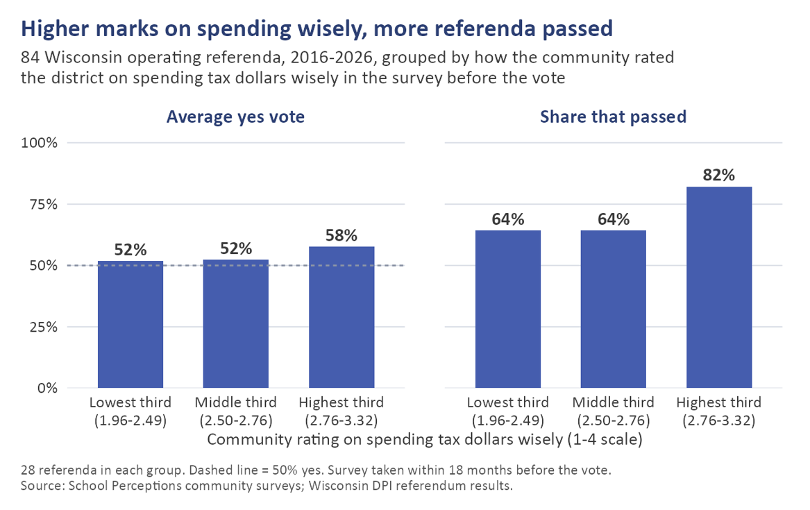
Second of all, it tracks how residents vote on their referendums. I matched community surveys to each district’s next referendum. Where residents gave the district its best marks on spending wisely (the top third of communities), voters supported 82% of operating. Everywhere else passed at a rate of 64%. Between 2013 (the year our community-survey dataset begins) and April of 2026, 71.7% of all referenda passed. So, our data shows that high-trust districts overperformed the average, and low-trust districts underperformed it.
The charts below show the link between the fiscal-trust measure and the percentage of the community voting “yes” on a referendum (that’s the left chart below), as well as the link between the fiscal-trust measure and the overall “pass” rate of operating referenda (the right chart).
|
What is this graph showing? On the left, you see the percentage of actual votes for operating referendums across various levels of “fiscal trust” measures. The higher the level of fiscal trust, the more voters are willing to say yes. On the right, you see a referendum pass rate comparison. The higher the level of fiscal trust, the more likely a referendum is to pass. |
The higher your community rates your fiscal stewardship, the more likely they are to vote yes on a referendum.
Now, again, we want to make sure we’re measuring what we think we’re measuring. We needed to control for other factors. So, I did.
The relationship holds up when we account for the size of the ask, the tax impact, local politics, and poverty. From the lowest-rated communities to the highest, it works out to roughly 14 points of voters’ “yes” vote. In an era where the average school referendum gets a 53% vote share at the ballot box, that’s a big deal.
It tracks enrollment, too. Same pattern as part one: a community in the top sixth on spending wisely, compared with one in the middle, saw about 1.4% more enrollment growth two years later, even after accounting for poverty.
Takeaway: the solution to external pressure is inside your buildings
School systems everywhere face a vicious cycle: declining enrollment saps revenue, which makes it harder to serve students and families, which exacerbates enrollment decline, and on and on.
That cycle can be reversed. Increasing enrollment yields additional revenue, making it easier to serve students and families, which grows enrollment, and on and on.
Positively engaging with your stakeholders (communicating frequently, responding visibly to feedback, explaining plans, and decisions) goes a long way toward cultivating the all-around confidence that maintains a school system as the anchor of its community even in the face of external headwinds.
Derek Gottlieb, Senior Research Director